


Full confession: I’m always tinkering with my palette. Yep, it’s true. I have a set of core colors that are on all my palettes, but I also like switching up colors for the seasons and places we’re going. What can I say, I’m a color nerd!
So by popular request, here’s my Fall 2023 Edition (all paints are Daniel Smith unless otherwise indicated, H=Holbein, WN = Winsor & Newton)
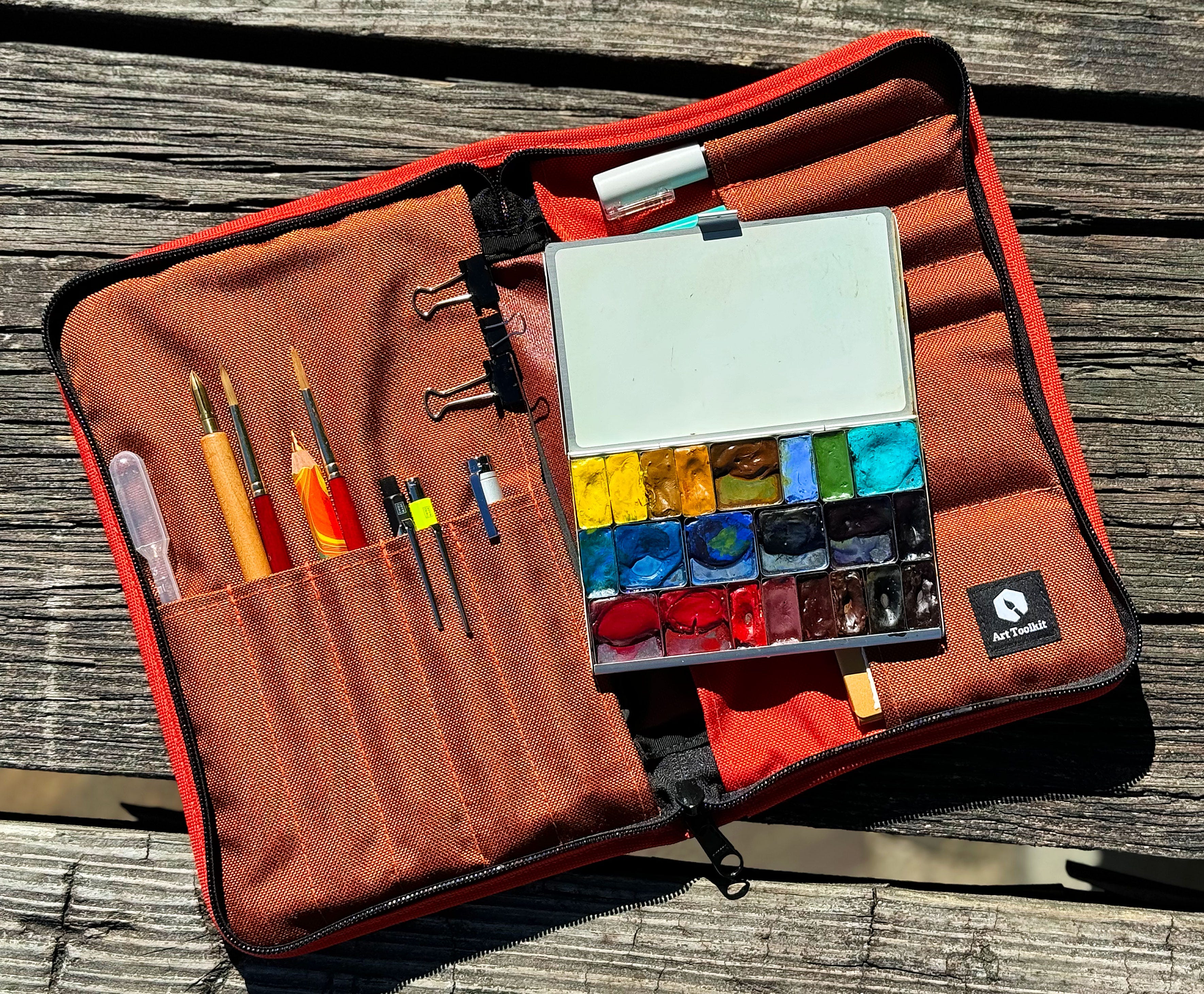
Double pans are intentionally filled part way to allow room to work the paint.
First row:
azo yellow, hansa yellow medium, Monte Amiata sienna, yellow ochre (Winsor and Newton), quinacridone gold, lavender (H), chromium green oxide, cobalt turquoise light (WN)
Second row:
manganese blue nova (H, it’s really phthalo blue), cerulean blue chromium, cobalt blue (WN), ultramarine blue deep (H), indanthrone blue, neutral tint (H)
Third row:
permanent rose (WN), quinacridone coral, perylene red, pink pipestone (WN), quinacridone burnt scarlet, transparent red oxide, Van Dycke brown, bloodstone genuine
And some notes about why I have these:
Check out this post over on my blog about my core colors.
I usually don’t have both yellow ochre and raw sienna on my palette, but I have a tube of Monte Amiata sienna I need to use up. I go back and forth on yellow ochre vs raw sienna all the time — would love to hear your thoughts.
I got a tube of manganese blue nova from Holbein to try — it’s actually made from phthalo blue. Really loving it so far!
quinacridone burnt scarlet is another new one for me that I just started using this summer — I’ve found it really helpful for botanicals
Van Dycke brown is great to get an instant dark brown and it rewets better than an umber. Bonus!
Bloodstone geniune is another color that I found a tube of hiding in a drawer so it had to come out and play. It’s been fun to use but I don’t think I’ll keep it on my palette once I use it up
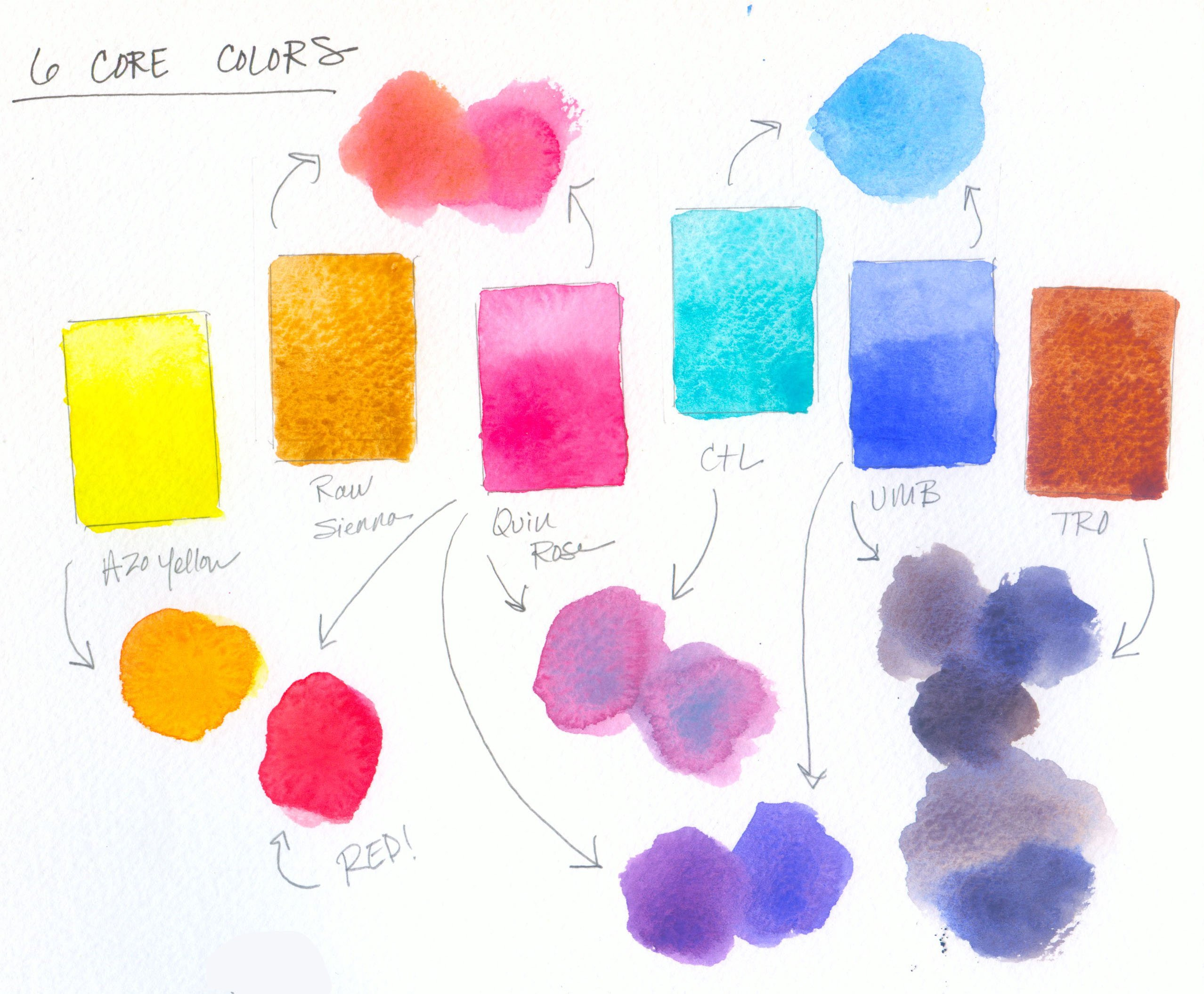
yellow notes: I like having both azo yellow since it’s a neutral, transparent yellow and hansa yellow medium since it’s more opaque
blue notes: cobalt blue is my go-to for skies, indanthrone blue is such an dark, moody, reactive blue, ultramarine is a staple, and cerulean blue chromium is fun to use as it’s so granulating
ultramarine blue deep or indanthrone blue plus transparent red oxide give glorious, rich dark blues and greys
quinacridone coral and azo yellow makes the best clear, transparent orange for all the fall leaves
cobalt turquoise light is one of my favorites — I love it mixed with ultramarine or cobalt blue for skies, quinacridone rose for purples, and venetian red for desert greens
I use transparent red oxide instead of the traditional burnt sienna since it’s so much more lively in mixes, and granulating too!
I usually have Venetian red where the perylene red is, but put the perylene there for fall — will swap it back soon.
Hope that sparks you, and please reach out if you have any questions!
Good morning, Lisa - I'm new to you (thank you, ArtToolKit peeps) and brand new to art, specifically watercolour. I've loved browsing your demo at AKT and your pix on IG. Naturally, i'm trying to figure out a great working palette for myself, and i'm trying lots of ideas. Your palette is lovely and has given me some great ideas. I did try to visit your palette info using [https://lisaspangler.com/2022/12/13/whats-on-my-palette/] but apparently that page is out of commission. Can you direct me to the post in which you discuss your Core Colors? Thank you so much!
I keep going back and forth between dv raw sienna and WN gold ochre (which is an orange hued yellow ochre, so it’s even more similar). MANS is also in the mix. Who can decide! I think Gold Ochre is ideal for fall foliage, as it looks just like a distant melange of all the maple leaf colors, but raw sienna, more transparent and a bit more muted, is just so useful as an all-purpose mixer. I prefer raw sienna in the winter and the desert.